The Saints’ new helmets are hideous
Since my teen years, I’ve been living a lie.
I’ve been keeping a secret; hiding something that’s rarely publicly discussed and when it is, is dismissed as childlike, weird, even.
I have a fetish. And that fetish is…football uniforms. I’ve always been fascinated by “athletic aesthetics,” a term coined by sports uni guru Paul Lukas, proprietor of the ultimate uniform news site, Uni-Watch.com.
There’s something extremely satisfying about a well-designed uniform. Nothing gets me excited quite like the perfectly placed accent or a pants stripe that’s exactly the right width. The Saints have a classic design that hasn’t changed much over the years, and the black and gold shoulder striping of the Color Rush uniforms gets me all hot and bothered.
One can imagine my excitement when word dropped that the Saints unveiled an alternate black helmet design. Then, unfortunately, I actually saw them.
As dedicated Who Dats will know, the Saints infamously wore black helmets during the 1969 preseason, a color scheme that inverted the black and gold of the traditional helmets.
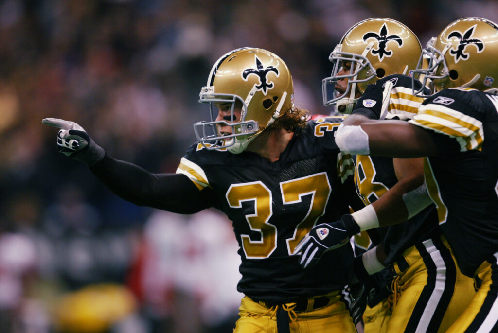
The black helmets have been the stuff of message board legend and it was rumored that the team wanted to bring them back (or some derivation thereof) in 2006, but then-commissioner Paul Tagliabue nixed the idea because he thought the color gold better represented the idea of rebirth.
Here are those ’69 helmets, in all their glory:
And here are the new shells, in all their boner-killing dreadfulness:
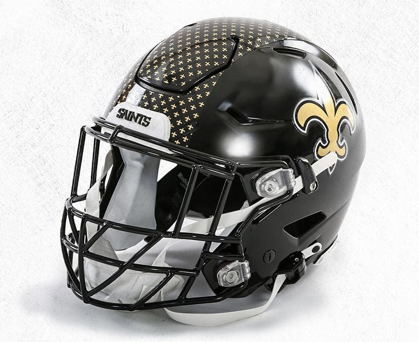
The Saints’ classic look has finally jumped the shark. For however many games the team wears these abominations, the team will look Nike-fied. Cheap.
According to NOLA.com’s Jeff Duncan, the new design was cooked up by general manager Mickey Loomis and former head coach Sean Payton, and the influence of two 50-something White men with no graphic design qualifications is clearly evident in the new digs.
The new helmets look like they were made by and for people who wear pleated pants.
The fleur de lis “stripe” looks like it belongs on officially-licensed vinyl table cloth.
They look like a knock-off you’d see on sale at Walmart.
Need I go on?
Actually, I will go on. Specifically, the problems with these helmets are threefold. First, the fleur de lis stripe is garish and out of place compared to the traditional triple-striping of both the normal uniform set and the Color Rush unis. The inverted white and gold striping on the ’69 helmets is much classier. The new “stripe” looks like wallpaper, or a napkin you’d use to wipe the mayo from the corners of your mouth after eating one of those perfectly triangular finger sandwiches.
Second, the black facemask combined with the black shell is boring. It’s too much black – the look needs contrast to break up the visual monotony. Black facemasks with gold helmets stand out, and the grey bars of yesteryear (and that one glorious Sunday Night Football game against the Bucs in 2002) create a visually pleasing contrast.
To my utter horror (and surely, the utter horror of other football fashionistas who “Get It”), the team released photos of Cam Jordan modeling the helmet with the sacred Color Rush uniforms, one of the classiest looks in the entire league and by far the Saints’ best current uni combo.
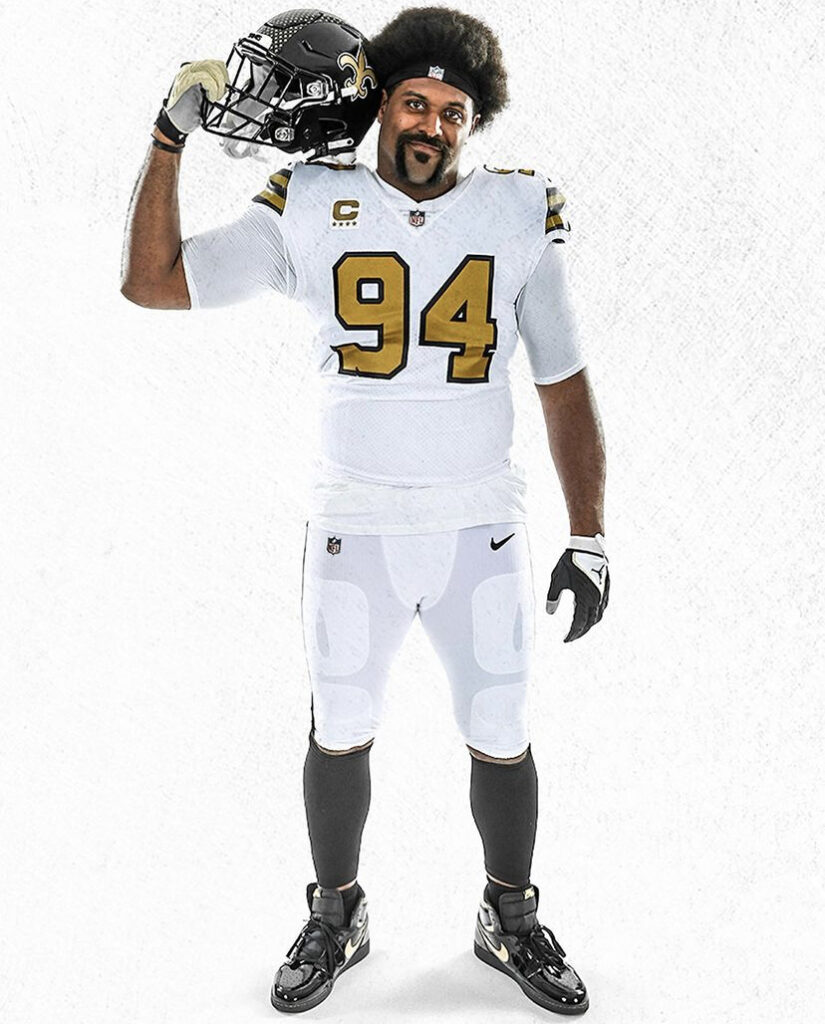
The modern-ish design of the new helmets clashes with the throwback feel of the Color Rush set, giving the impression a 5-year-old created this visual cacophony in a Madden video game.
In fact, the new helmets don’t match any of the other uniforms because of a critical aesthetic flaw in Nike’s design. The black plastic has a glossy finish, while the black fabric of the Nike uniform jerseys and pants is matte. One is shiny, the other flat.
This third flaw in the helmet design speaks to a larger issue with the Saints’ duds, which Nike has manufactured since 2012: the matte yolk of the pants (as well as the jerseys) clashes with the metallic finish of the gold helmets.
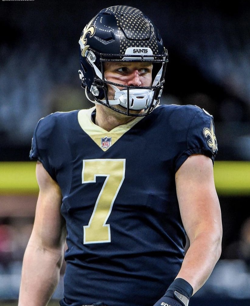
Is it too much to ask to bring back the shiny pants? The flat finish of the current set’s black, gold and white (BORING!) bottoms evokes the obsolete pants from years past that a high school team might use at practice.
Ultimately, the Saints are a victim of their own success. When your head coach and general manager change the culture and turn the franchise into a perennial contender, becoming local legends in the process, we must suffer through their questionable fashion choices.
A small price to pay for the Lombardi Trophy, I suppose.


